










Your CRM holds an enormous amount of data. Deal stages, activity logs, email open rates, pipeline values, team performance — all of it is in there. The problem is that raw data buried in records and folders doesn't tell you anything on its own. Teams that rely on CRM dashboards to surface that data make faster decisions, spot problems earlier, and spend less time in status meetings.
That's exactly what a CRM dashboard is for. CRM dashboards come in several types, each built for a different role and use case — and in this guide we'll cover what types exist, which metrics to track, and how to set up CRM dashboards your team will actually use.
- A CRM dashboard is a centralized, visual interface that transforms raw customer and sales data into actionable metrics you can act on immediately.
- Dashboards update in real time; reports are static snapshots — they serve different purposes.
- There are 7 main types of CRM dashboards, each designed for a specific role or use case.
- The most important KPIs fall into three categories: pipeline health, revenue performance, and sales activity.
- NetHunt CRM now supports MCP, meaning you can query your CRM data through ChatGPT, Claude, or other AI tools using plain language — no manual searching required.
What is a CRM dashboard?
A CRM dashboard is a centralized visual interface that transforms raw customer and sales data into actionable metrics. It gives you a live view of what's happening in your business right now — deals in progress, team activity, revenue on track or at risk — without having to dig through individual records or run manual reports in your CRM system.
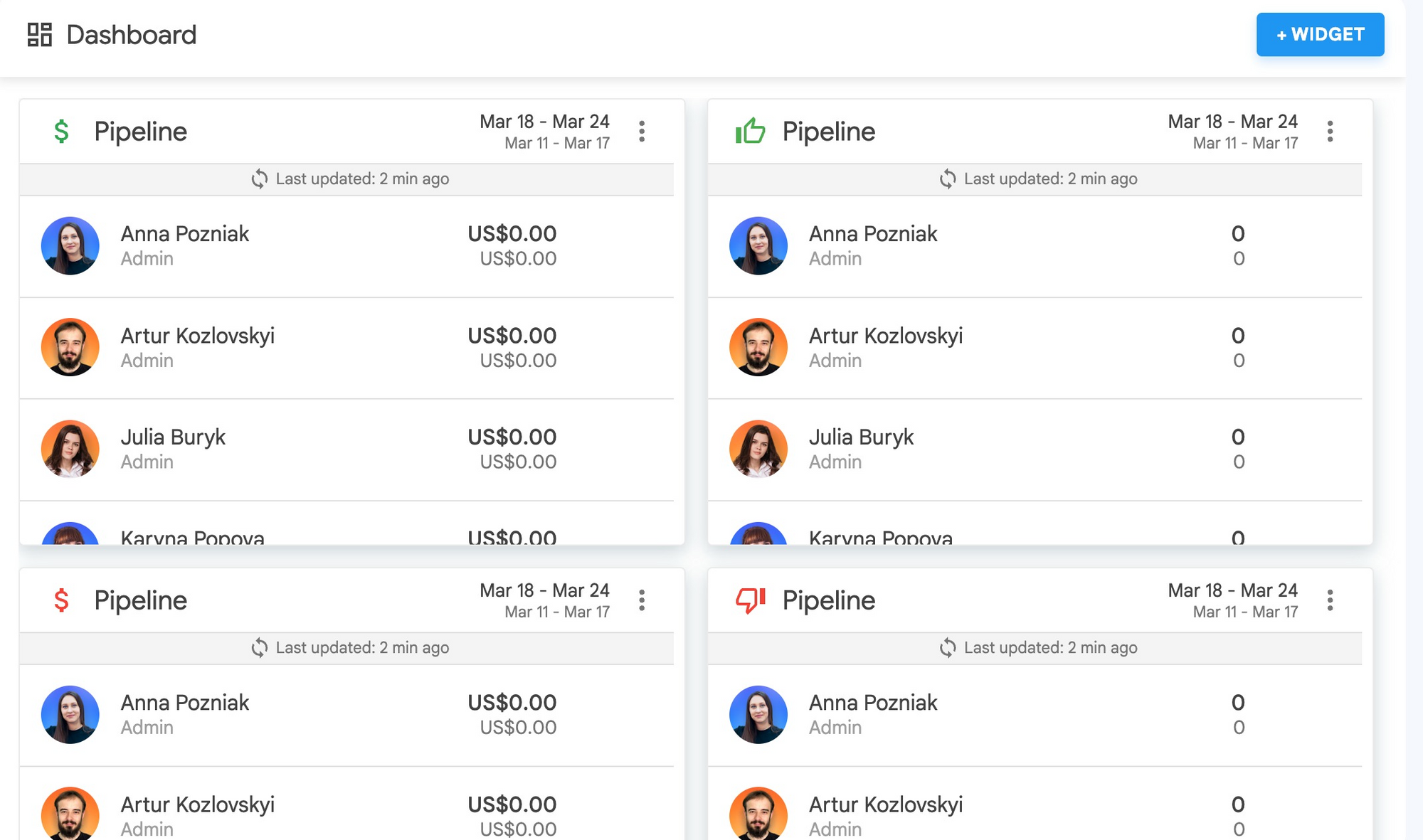
Modern CRM software builds dashboards from widgets: individual visual elements that each display a specific metric or dataset. A good CRM dashboard allows you to combine multiple widgets into a single view tailored to your role, your team, or a specific business goal. CRM dashboards provide real-time visibility into the numbers that matter — pipeline health, deal velocity, team activity — so that every team member can start the day knowing exactly where to focus.
Dashboards use widgets, charts, and live data feeds to surface the right numbers at the right moment. The key word in any useful definition of a CRM dashboard is actionable. A good dashboard doesn't just show you data — it shows you what to do next. That's what separates a dashboard from a report.
CRM dashboard vs CRM report: what's the difference and when to use each
People use these terms interchangeably, but they serve different purposes.
A report is a static snapshot of your data at a specific point in time. You generate it, it captures what happened up until that moment, and then it's done. They're useful for reviewing performance over a completed period, sharing results with stakeholders, or running a monthly analysis. When you need a detailed breakdown of closed deals over the last quarter, a report is the right tool. For a deeper dive, see our guide to CRM reporting.
A CRM dashboard is live. It pulls real-time data and updates automatically as deals move, activities are logged, and leads come in. Where a report tells you what happened last week, a dashboard shows you what's happening right now. CRM dashboards show current pipeline status, today's tasks, and this week's activity numbers — without anyone having to manually compile anything.
In practice, many CRM platforms — including NetHunt — let you build dashboards from reports. You create a report that defines what data to pull, and then you pin it to your dashboard as a widget so you can monitor dashboard metrics at a glance without running the report again.
Why your sales team needs a CRM dashboard
Different people need different things from a dashboard. Here's what it looks like across the main roles:
- Sales reps use dashboards to manage their day. They want to see their open deals, upcoming tasks, how many emails and calls they've made this week, and how close they are to hitting their monthly quota. A well-configured CRM dashboard helps each sales rep start the morning knowing exactly where to focus — without opening five different views or asking their manager for a status update.
- Sales managers use dashboards to manage their team. They need to see who's on track on the team, who's falling behind, where deals are getting stuck in the pipeline, and whether activity levels are consistent with targets. A CRM dashboard enables managers to surface these signals without a team meeting or a manual check-in.
- C-level executives use dashboards for the big picture. Revenue against target, quarterly forecast, customer acquisition trends, and pipeline coverage ratio. They don't need the granular detail — they need the signal that tells them whether the business is on track.
- Marketers use dashboards to connect their activity to revenue. Email campaign performance, lead conversion rates by source, and which campaigns are generating closed deals — not just leads — are the metrics that matter.
In every case, the core value is the same: teams stop hunting for information manually, you look at your dashboard and know immediately.
7 types of CRM dashboards (with examples)
Not all dashboards are built the same. Here are the top CRM dashboard examples across seven categories. Each one shows different data — dashboards display exactly the metrics their audience needs, nothing more.
Sales pipeline dashboard
The most common CRM dashboard type. A sales pipeline dashboard gives you a visual overview of all active deals across every stage of your pipeline — how many deals are at each stage, their combined value, and how they're progressing.
Key metrics to include: total pipeline value by stage, weighted forecast amount, deals closing this period, stage conversion rates, and pipeline coverage ratio (pipeline value vs. quota target).
This dashboard is most useful for sales managers running weekly deal reviews and for reps who want to see which opportunities to prioritize this week.
Activity dashboard
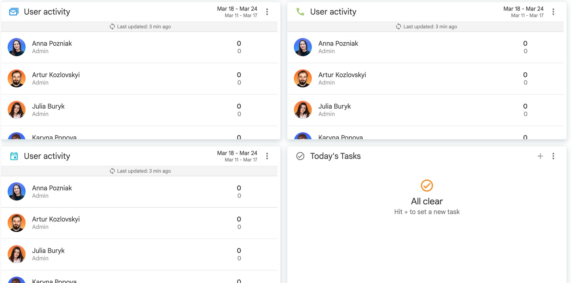
Sales is an activity-driven game. The activity dashboard tracks what your team is actually doing day-to-day: emails sent, calls made, meetings held, tasks completed. It pairs naturally with automated workflows that log activity without manual input. It's a leading indicator — it tells you whether the work that generates future revenue is being done right now. CRM dashboards track this data automatically as your team logs interactions, so nothing gets missed.
Key metrics: daily call volume, email open and reply rates, meetings booked vs. completed, task completion rate, and follow-up response time.
Team performance dashboard
This dashboard compares performance across individual reps — useful for identifying top performers, spotting who needs coaching, and keeping the whole team accountable. Most CRM software displays this as a leaderboard-style view.
Key metrics: revenue per rep, win rate by rep, closed deals this period, activity score, and quota attainment percentage.
Revenue forecast dashboard
The forecast dashboard combines your current pipeline with historical win rates to project where you'll land at the end of the quarter. It's the dashboard executives and revenue operations teams care about most. This type of executive dashboard is designed to be read in under a minute — all signal, no noise.
Key metrics: committed vs. best-case revenue scenarios, pipeline coverage ratio, variance from target, and historical forecast accuracy.
Leads dashboard
This dashboard sits at the top of the funnel and tracks the volume, quality, and source of incoming leads. It's the connection point between marketing activity and sales pipeline — showing which lead sources are actually generating revenue, not just volume. Dashboards can help marketing and sales teams stay aligned by making this data visible to both.
Key metrics: lead volume by source, qualification rate, lead response time, and lead-to-opportunity conversion rate.
Campaign performance dashboard
Designed for marketing teams, this dashboard tracks how email campaigns, sequences, and outreach efforts are performing. CRM dashboards work especially well here because they pull campaign data directly from your CRM, connecting outreach to pipeline outcomes in one view.
Key metrics: email open rates, click-through rates, reply rates, conversion to deal, and customer lifetime value by campaign.
Executive summary dashboard
A high-level view built for leadership. No operational detail — just the metrics that tell the story of business health at a glance. Updated in real time, but designed to be checked weekly rather than daily.
Key metrics: total revenue vs. target, year-over-year growth, customer acquisition cost, average deal size, and churn rate.
KPIs every CRM dashboard should track
Across all dashboard types, CRM metrics fall into three categories. Teams use CRM dashboards to track metrics across three categories. Knowing which category a metric belongs to helps you build dashboards that are actually useful rather than cluttered.
Pipeline health metrics are forward-looking — they predict what revenue will look like in the future.
- Pipeline value by stage (a different dashboard view per stage helps managers spot bottlenecks)
- Stage-to-stage conversion rate
- Deal velocity (average time from first contact to close)
- Deal aging (how long opportunities sit in specific stages)
- Coverage ratio (total pipeline vs. quota)
Revenue performance metrics measure what's already happened or what's being committed to.
- Monthly and quarterly revenue vs. target
- Average deal size
- Win rate
- Revenue per rep
Sales activity metrics are leading indicators — the behaviors that eventually produce pipeline and revenue.
- Call volume (daily and weekly)
- Email engagement rates
- Meeting conversion rate (scheduled vs. completed)
- Follow-up response time
The most effective kpi dashboard balances all three categories. If you only track revenue, you're always looking backward. If you only track activity, you don't know if the activity is producing results. The combination tells the full story.
How to choose the right CRM dashboard for your team
The best dashboard for your team is the one that answers the question you ask most often. Here are four scenarios to help you decide where to start:
- If you're a sales rep managing your own pipeline, start with a sales pipeline dashboard combined with a today's tasks widget. You need to see your active deals and what you need to do about them — nothing more complicated than that.
- If you're a sales manager with a team of 3 or more reps, build a team performance dashboard alongside a pipeline dashboard. Different views serve different needs: you want to see both what deals exist and which team members own them, so you can coach in real time rather than at the end of the month.
- If you're a founder or executive, prioritize the revenue forecast and executive dashboards. You don't need operational detail — you need the signal that tells you whether to intervene or stay the course.
- If you're running marketing campaigns, start with the leads dashboard and campaign performance dashboard. Your goal is to connect top-of-funnel activity to bottom-of-funnel results, and these two dashboards together give you that picture.
A practical rule: start with one dashboard, not five. Pick the view that answers your most important recurring question, get comfortable with it, and add more dashboards as your needs become clear.
How to build custom CRM dashboards in NetHunt CRM
NetHunt CRM is a customer relationship management platform built inside Gmail. It comes with customizable dashboards that update in real time — which means you get a real-time view of your CRM data without opening a separate app or switching tabs. Building a dashboard in NetHunt takes a few minutes, and the result is a customizable CRM dashboard that updates automatically as your team works.
Here's how to create a dashboard in NetHunt step by step:
- Step 1 — Access your dashboard. Click on your workspace name in the left panel of NetHunt. This opens the dashboard view, where you'll see the default system widgets.
- Step 2 — Review the system widgets. NetHunt comes with three built-in system widgets out of the box: Folders (shows all folders in your workspace), Team & Permissions (user management), and Subscription. Dashboard creation starts here.
- Step 3 — Build your custom reports. Custom dashboard widgets in NetHunt are built from reports. Navigate to the Reports section and create the report you want to display — for example, a pipeline report grouped by stage, or a team activity report filtered to this week.
NetHunt's native report types include:
Pipeline Reports — deal distribution by stage, deal values, and stage-level conversion
Team Performance Report — activity metrics by individual rep
Team's Goals Reports — quota progress and goal attainment
Time in Stage Report — how long deals spend at each pipeline stage (useful for identifying bottlenecks) - Step 4 — Pin reports to your dashboard. Once you've created a report, add it to your dashboard as a custom widget using the "Add Widget" button. You can add multiple widgets and arrange them however makes sense for your workflow. This updates in real time as your team logs activity. Once you create dashboards for each main use case, share them with the relevant people on your team.
- Step 5 — Share the dashboard with your team. Managers can configure dashboard views and share them with their team so that every team member starts from the same live view. This eliminates manual reporting and keeps the whole team aligned without a weekly sync just to share numbers.
For teams that need deeper data visualization, NetHunt also integrates with Looker Studio and BigQuery, which lets you pull CRM data into custom visual reports and dashboards.
How to analyze your CRM data with AI (MCP)
In July 2026, NetHunt launched MCP (Model Context Protocol) support — which changes how you interact with your CRM dashboard data in a fundamental way.
Instead of building a dashboard and checking it manually, you can now connect ChatGPT, Claude, Grok, or other AI tools directly to NetHunt and query your data in plain language. CRM dashboards can help you see the big picture, but AI lets you go deeper — instantly, without configuring a new view.
Some examples of what that looks like in practice:
- "Find Acme company and summarize the latest interactions."
- "List all deals with no activity in the past two weeks."
- "Which marketing campaigns generated the most closed deals last month?"
- "Show me who changed the status on this deal, and when."
- "Create tasks for all deals in the Negotiation stage that haven't had a follow-up in 5 days."
With MCP connected, AI tools can work with your folders, records, and full activity timeline in NetHunt. They can search, create, update, and delete records — all through natural language, without manual searching or tab-switching. Instead of digging through records manually, you get answers instantly.
This doesn't replace dashboards — it adds a layer on top of them. Your dashboard gives you the at-a-glance view; AI gives the ability to ask a follow-up question and get an instant answer from your actual CRM data. Together, they go well beyond what any static view can offer.
Learn how to set up MCP in NetHunt →
CRM dashboard best practices: what makes a good CRM dashboard
Getting value from a CRM dashboard isn't just about what you put on it — it's about how you use it. CRM dashboard features vary across platforms, but these principles apply regardless of which tool you choose. Whether you're using a CRM dashboard template to get started or building from scratch, here's what separates effective dashboards from cluttered ones.
- Keep each dashboard focused on one audience. A dashboard built for a sales rep and a dashboard built for a CEO should look completely different. If you try to serve both in one view, you end up serving neither well. Customize dashboards by role, not by preference.
- Limit each dashboard to 5–8 widgets. More than that and people stop reading it. Every widget you add competes for attention. If something isn't being acted on regularly, remove it. Good dashboard design is about subtraction as much as addition.
- Use multiple dashboards rather than one giant view. An effective CRM dashboard does one job well. Build a CRM dashboard template for each main use case — pipeline review, team performance, executive summary. A sales dashboard template is particularly useful for onboarding new reps: give them a pre-configured view on day one — and let people choose the right one for the moment.
- Make sure the underlying data is clean. A CRM dashboard provides an overview of your data — but that overview is only as accurate as what's in the CRM. If your team isn't logging activities consistently, your activity dashboard will be misleading. Learn how to build a team activity report in your CRM to keep this data clean. CRM data quality is a precondition for useful dashboards.
- Use dashboards to coach, not to surveil. When managers use dashboards primarily to catch people doing things wrong, reps start gaming the metrics. The best use of a performance dashboard is to identify where a team member needs support and have a specific, data-driven conversation about it.
- Start with the question, not the metric. Before adding a widget, ask: what decision will this help me make? If you can't answer that, the widget probably doesn't belong on your dashboard.
FAQ
What should a CRM dashboard include?
Every useful CRM dashboard should include at least one metric from each of the three main categories: pipeline health (to predict future revenue), revenue performance (to measure current results), and sales activity (to track the behaviors driving both). Beyond that, what a dashboard includes depends on the role it's built for. A sales rep's dashboard looks different from a sales manager's or an executive's.
How is a CRM dashboard different from a CRM report?
A report is a static document generated at a specific point in time — useful for reviewing a completed period or sharing with stakeholders. A CRM dashboard is live: it updates automatically as your data changes and gives you a real-time view of what's happening right now. In NetHunt, both tools work together — you build a report and pin it to your dashboard as a widget.
Can I share a CRM dashboard with my team?
Yes. In NetHunt, managers can configure a dashboard and share it with all team members so everyone works from the same live view. This eliminates manual reporting and keeps the whole sales team aligned without requiring a sync meeting just to share numbers.
What KPIs should a sales manager track on their CRM dashboard?
Sales managers typically need a combination of pipeline metrics (pipeline value by stage, conversion rate between stages, deal aging) and team performance metrics (activity by rep, win rate, quota attainment). The goal is to see both where deals stand and what each rep is doing about them — so you can coach proactively rather than reactively.
How do I connect AI to my CRM dashboard?
NetHunt supports MCP (Model Context Protocol), which lets you connect AI tools like ChatGPT or Claude directly to your CRM. Once connected, you can ask questions in plain language — "which deals have gone quiet this week?" — and get answers drawn from your actual CRM records and activity history. When your CRM integrates with AI via MCP, your dashboard data becomes conversational. Setup instructions are available in the NetHunt changelog.




 product experts — let's find the best setup for your team