


Every little detail matters, especially when it comes to something as intricate and competitive as email marketing.
That’s why you need to make sure you don’t just focus on the ‘what’s of your next email copy but also pay close attention to the ‘how’s of it. There should be a balance of form and content.
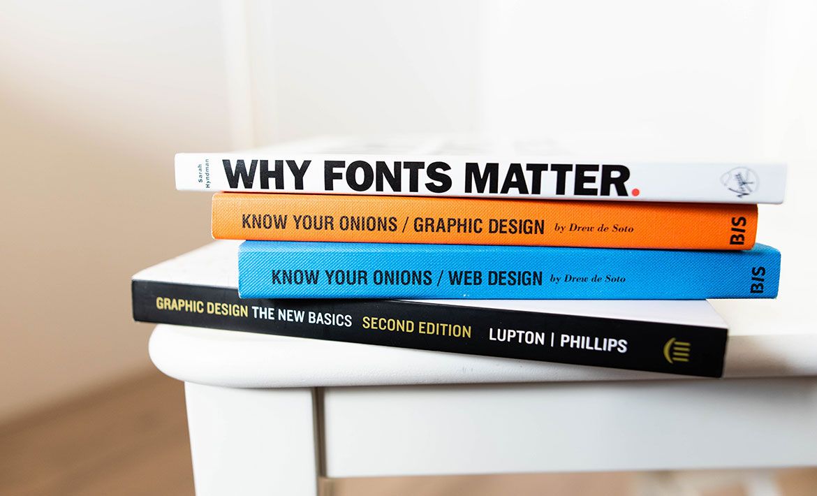
One such essential ‘how’s of email marketing is the font you use for your campaigns.
Why Is Font an Important Element of Your Email Design?
In our previous post, we’ve already covered the importance of choosing the right colours to use in your emails. Incorporating relevant colours can help you strengthen your email marketing campaigns and deliver the right message to your target audience. However, it’s not just colours that have an impact on how your email subscribers perceive your brand; fonts do, too.
Every font has a personality. The combination of fonts you use in your marketing assets is an integral part of your branding and should be taken seriously. Here are just a few reasons how fonts can make a difference:
- It helps to build and boost your brand awareness. Just like colours and logos, the font you use in your emails helps your target audience to make a connection between the content they receive and your brand. That’s why it’s important to make sure you stay consistent with the fonts you exploit in your email marketing assets.
- It strengthens your message when used appropriately. Back in 2013, two researchers Kang and Choi created ads for a mobile phone. When ads highlighted the “slim” nature of the phone, condensed typefaces performed better:
Alternatively, when ads talked about how ‘elegant’ the phone was, the fancier font turned out to be more successful.
- It creates meaning. Using popular fonts can present you as a fashion-forward brand that keeps up with the trends.
- It drives conversions. Strategic use of fonts can boost your conversion rates by driving your email readers’ attention to the correct parts of the email, i.e. your CTA.
With all of the aforementioned in mind, it’s safe to say that your choice of fonts can affect your email marketing conversions. That’s why you need to make sure you nail your email marketing typography as soon as possible.
Email Font Choice Best Practices
#1 Align your email’s fonts with your branding
First things first, you need to make sure that the fonts you use in your email marketing campaigns are well-aligned with your general branding strategy. They need to complement the message your brand conveys to its target audience and not confuse people by going in a completely different direction from the image you’ve created.
Let’s play a little game.
Take a look at the following three fonts and tell me which one you’d pick for an email campaign to promote a fitness class, a flower shop and a board game:
It’s likely that you said that font C is the best fit for a fitness class, font B would work well with a flower shop, and font A is a decent option for a board game email.
Is that right?
Chances are, this was your exact response (or at least, this is the exact response of the majority of the people taking part in the survey).
Why?
Because each font has its psychology. For instance, font C is bold and powerful - a perfect match for a gym promo email; font A looks funky and goofy - it looks like you’d have a good time playing the board game; and font B is very smooth and feminine - just like beautiful flower bouquets.
You’ve answered the way you answer because of your brain’s associative network.
It’s really important to make sure you understand your audience and what their pain points are so that you could appeal to them and use fonts with appropriate connotations. With that in mind, you also need to be aware of the most common connotations the fonts you intend to use have and avoid mixing them up.
A really good example of ‘mean well, do bad’ is a font called Fraktur.
Context aside, it’s a beautiful tall, thin, and elegant font - a great choice for, say, a perfume business email campaign. However, put into context, it immediately becomes inappropriate and gruesome. The problem with Fraktur is, it was used for Nazi propaganda and is commonly associated with Nazis. Had you used it in your email campaign, you’d immediately ruin your reputation and brand image.
#2 Make sure to keep fonts neutral
Everything is good in moderation.
You need to remember that although the font is important and helps to deliver a message, it shouldn’t steal the spotlight. Don’t go overboard with different font styles and don’t make them too distracting. After all, you don’t want the font to drive your reader’s attention away from the CTA button.
The same applies to the maximum number of fonts you should use in your email. NetHunt recommends you use no more than two different fonts and make sure they complement each other and work in tandem.
#3 Focus on ensuring legibility
Take a look at the two following paragraphs, read the instructions and time how quickly you follow them.
Even if you didn’t time yourself, you must have noticed that the second text took you much longer to get through. That’s because it’s far less legible than the first one.
Fonts have an immense impact on our cognitive abilities and alter the way we perceive information. That’s why you need to ensure you do everything possible to keep your fonts legible.
#4 Size matters
We’re not saying that you can’t use an intricate font. Of course, you can! Fancy fonts can be a real blessing when it comes to making your email campaign stand out, especially if it fits your branding.
You just need to make sure that despite their funky appearance they are still both readable and can be scanned through with ease. That’s why font size matters. Have a look at this email by Email Weekly:
Even though the headings use a rather complicated font style, you still don’t feel conflicted when trying to read them. That’s because the letters are big enough to not collapse into one illegible chunk of characters.
The standard ‘golden’ font size for emails is 12-point.
This font size is the most common and, therefore, reduces the overall reading time. The other font sizes commonly used in emails are 10-point and 14-point.
NetHunt Pro Tip:
- Don’t use 12-point font sizes for the headlines as they won’t attract attention.
- 12-point size works perfectly for the main body content.
- Use 10-point sizes if you want the readers to interact with your email for a little longer.
#5 Use scales to show hierarchy
The main goal of all email campaigns is to convert readers. To achieve that goal, an email needs to lead the reader towards taking the desired action, driving their attention to the CTA.
You can do that by using different colours, incorporating eye-catching images and other visual cues, but at the end of the day the effectiveness of your efforts boils down to how well you manage to structure your email. And the easiest way to structure your email is by using a scale of type sizes.
The same way you italicize a few words within the body of the text to show emphasis, you can highlight the importance of certain groups of text by altering their font size. For instance, the title or main heading is the star of your email, so it should evidently be the largest of the bunch. It’s then followed by a slightly smaller subheading, and the body of the text appearing a little smaller than the previous.
Have a look at how NetHunt uses scales to structure emails:
Taking this approach doesn’t just make the entire text body look more organised, but it also provides your readers with more straightforward navigation. They can easily find the bits that interest them the most and jump directly to those.
#6 Play it safe by choosing web-safe fonts
Why can’t I choose whichever font I like? The options are unlimited!
That’s true, after years and years of hard work designers from around the world have accumulated a huge library of fonts for you to choose from. Theoretically speaking, you could go for any of them when crafting an email.
But considering that you’re a business and the only reason you even bother with designing an email campaign is for it to reach the subscribers of your mailing list and be read, the pool of options quickly narrows down to a selected bunch.
The problem is — you don’t send fonts yourself, but use other peoples’ instead. Therefore, it’s not just you that has to have the font installed for the email to be displayed properly. The font needs to be compatible on the recipients’ end for their email client to display the text you send in the intended style.
‘Over 70% of people will delete an email in three seconds or less if it doesn’t display correctly on their device—whatever that device may be. Another 15% of people will just unsubscribe instead of deleting the email’
[Campaign Monitor]
That’s why one of the wisest decisions you can make when choosing a font for your next strategically important email campaign is to go for one of the ‘safe’ options, cross-platform fonts that are compatible with a variety of different email providers.
There are two types of Web Safe cross-platform fonts — Serif and Sans-serif. ‘Serif’ means there’s a little tail at the end of each letter, and ‘sans-serif’ fonts don’t have it.
There are pros and cons associated with the use of Web Safe fonts in email marketing:
At the end of the day, you need to decide which factors are more important to your email campaign and whether you’re ready to make sacrifices for improved accessibility.
Serif Fonts
Serif fonts are the aristocratic gentleman in the world of typography. They’re believed to be an indicator of an established and traditional company that can be and should be trusted. If that’s the impression you want to make on your audience, serif fonts are your go-to option.
Some of the associations and emotional responses a serif font evokes when implemented in an email include trust, respect, formality, authority.
This makes serif fonts a great match for the companies that operate in more traditional industries. For instance, they’ll be good for your emails if you’re a:
- Financial company
- Law firm
- Insurance company
- Consultant.
Times New Roman
Times New Roman is the font that doesn’t need any introduction - it’s the most well-known typecase among Web Safe fonts.
Because of the fact that almost all research papers and formal scholar assignments use Times New Roman, this font is usually associated with tradition, elegance, authority, conformity and trustworthiness.
However, there’s also a chance that you could come across as a little bit lazy if you hung on Times New Roman too much. At the end of the day, it is the most basic standard font.
It goes well with Arial, Georgia, Gotham, Helvetica Neue, Neutra Display, Goudy Trajan, Avenir, Helios, Lucida Grande and Zona.
Georgia
Being the second most commonly used serif font, Georgia is a great alternative to Times New Roman. This font is inherently legible: not only does it feature largely-spaced letters, but the character designs that this font uses help to make each letter distinct. This helps to prevent confusion when reading and adds credibility to the text.
On top of that, there’s a good variance between regular and bold weights, which allows you to add emphasis without having to introduce another font to the email.
It goes well with Proxima Nova, Helvetica Neue, Brandon Grotesque, Arial, Freight Sans, Lucida Grande, Open Sans, Benton Sans, Helvetica and Lato.
Palatino
Palatino is a very noble font that was initially created to mimic the humanist types of the Italian Renaissance. However, unlike most Renaissance typeface revivals, Palatino can boast having slightly larger proportions. This increases the font’s legibility and makes it appropriate to use in the body of the email the same way it’s okay to use it for the headline.
It goes well with Helvetica Neue, Avenir Next, Sanchez, Flat, Brandon Grotesque, Arial, sans serif and Open Sans.
Sans-serif Fonts
On the other hand, sans serif fonts are more of a know-it-all older brother, with a Harvard scholarship and a bright future waiting ahead. These fonts are typically viewed as sleek, cool, cutting edge, tech-savvy, and modern. The reason for this association is simple: sans serif fonts are the usual choice for tech companies.
You should opt for sans serif fonts if you want to evoke the following associations with your brand:
- Sophisticated
- Straightforward
- Modern
- Trustworthy
- Tech-savvy
- Cutting-edge
Sans serif fonts are the best choice for those companies that want to appeal to their audience as an innovative, sophisticated, and bold organisation. It’s the go-to fonts for:
- Tech enterprises
- Fashion brands
- Start-ups
Verdana
Verdana is a staple font supported by most email clients. It was developed with screen displays in mind, which makes it a great choice for any sort of email. Thanks to the wide characters and large spacing between each character Verdana guarantees on-screen legibility.
Verdana is believed to be the most fitting font for short blocks of text and headers.
It goes well with Arial, FF Tisa, Scala, Enriqueta, Lucida Grande, Calendas, PT Sans and Futura PT.
Trebuchet MS
Trebuchet MS is on the more elegant, feminine side of sans serif fonts as it has subtly curved embellishments. It can be used to your advantage if you seek a more ‘attractive’ font for your email, but beware of the fact that these embellishments may decrease overall readability for long passages of text.
It goes well with Helvetica Neue, Lucida Grande, Arial, Open Sans, Helvetica.
Arial
Arial is yet another extremely popular font. It’s modern, sleek, classy, and professional. You can’t go wrong with choosing Arial for your emails because it’s the standard font for a lot of email clients. With that being said, you need to make sure that you don’t overuse it and mix it up with some other fonts because it can make your email look a bit plain otherwise.
It goes well with Georgia, Lucida Grande, Oswald, Times New Roman, Bourgeois, Helvetica Neue, Bebas Neue, Segoe UI, Verdana and Theinhardt.
Impact
Impact is a very well-known font on the internet. The reason for this is the wide use of Impact in meme-making. Ever since the dawn of the meme era back in 2012, people have been using this typeface to create funny images to post online.
That’s why despite a seemingly bold and assertive look, Impact also has humorous connotations. You need to make sure to keep this in mind when crafting an email since you might undermine your credibility ever so slightly by ignoring this fact.
Regardless, Impact is a good choice if you want your email to have some boldness and loudness to it, and you don’t mind it being perceived as ‘masculine’. Impact makes an impact.
The best pairing for Impact is Baskerville.
Comic Sans
When inventing this font, Vincent Connare, the creator of Comic Sans said: 'Comic dogs don't talk in Times New Roman'. That’s pretty much all you need to know about this font. It’s lighthearted, informal, and somewhat goofy; commonly used to deliver playful messages. Therefore, it’s not to be used for any serious, formal emails.
Just make sure what you’re doing when choosing Comic Sans for your next email campaign. While it’s technically a Web Safe font, it’s not necessarily a versatile one. It’s a font a lot of people love to hate: there are definitely audiences who don’t mind it, but there’s also a "Ban Comic Sans" movement that’s been around since 2002.
So you better segment your audience well.
There isn’t really a font Comic Sans would go well with. This font is a statement in itself, and adding anything else would be overwhelming.
#7 Choose an appropriate fallback font
Of course, the eight fonts mentioned above aren’t all Web Safe fonts have to offer. But it would be ignorant to claim that the library of cross-platform fonts is huge. It is, indeed, very limited.
If you want to risk the legibility of your emails in order to allow yourself some more creative expression in your emails, you can always go for Web fonts. After all, if things don’t work out and your email recipient doesn’t have the font you included in your email installed, most email providers have their own emergency font style in place to compensate:
- Apple: Helvetica
- Gmail: Arial
- Outlook: Calibri
All three of these fonts have different characteristics and, therefore, have different connotations. Helvetica is bold, Arial has somewhat narrow spacing, and Calibri is sophisticated. This can alter the way your message is perceived and change the outcome of your email campaign. To avoid any mishaps, you need to make sure you choose a backup web-safe font.
It’s not just the aesthetics of the intended font that you need to keep in mind. You also need to pay close attention to the height of the fallback font as it will influence the appearance of your email. Have a look at how different fonts display with similar heights in this GIF:
#8 Make sure you test the fonts you use
Last but not least, you need to remember that all the effort you put into choosing the right font for your email campaigns will only pay off if your views align with the views of your mail subscribers.
In order to maximise the effectiveness of your email typography, you need to test different options out, preferably by putting your email campaigns to an A/B test. This will help you gather insights into the preferences of your actual target audience and not just generic advice that may be inapplicable to your particular case.
Now that you have all this knowledge about email design, make sure to check out our article about building remarkable email templates!


 product experts — let's find the best setup for your team