


Ask, and you shall receive.
If you want more conversions… Just ask for it!
A successful call to action is a key ingredient of any marketing program. You can’t possibly drive conversions unless you direct your audience towards the steps they need to take.
Therefore, right now I’m going to invite you to learn everything you need to know about creating a killer CTA with a neat little CTA:
Read on to find out the secrets of creating a powerful CTA!
Is it a good CTA? Once you’re done reading this article, you’ll be able to break it down and give it a fair judgement, so let’s get started.
What is a CTA?
Call-To-Action, better known as CTA, is a marketing term that refers to any marketing device designed to prompt an immediate response from the audience. It’s essentially the next step that marketers want their audience to take in order for them to eventually move further down the conversion funnel.
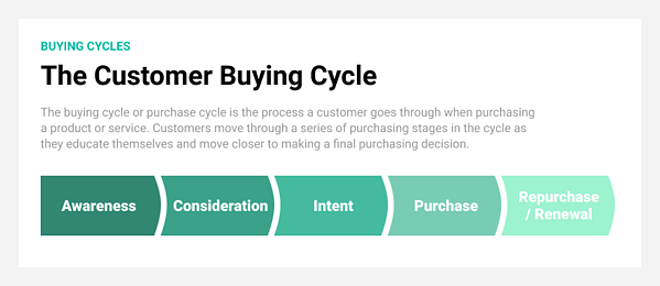
Depending on the stage of the buying cycle that the lead is currently at, the CTAs will vary in hardness. Those leads who’ve already been nurtured enough and are close to finally making a purchasing decision require a hard CTA. For everybody else, on the other hand, a softer one will work much better.
Let’s have a look at the difference between these two types of CTAs:
Don’t be tricked by the last row though! You can’t just go with one type of CTAs and call it a day - it’s absolutely mandatory to have both of them to ensure conversion. Hard CTAs are necessary to close the deal and generate sales. However, they can be quite intimidating for everyone who isn’t 100% certain they want to make a purchase with you as they’re often associated with making direct contact with the company (‘Contact Us!’, ‘Request a Quote!’). Not everyone is ready to take a step that large. Therefore, you need an alternative way to reach out - a softer CTA.
Instead of plunging towards closing the deal, take baby steps.
If you fail to provide one, the visitors who aren’t ready to talk to your sales reps might simply turn around and walk away without even getting to know you first. This is the last thing you want to happen.
Instead, you’re looking for a less-intrusive way to envelope them into your sales funnel and gather their contact information. It can be done by asking them to join your mailing list, offering exclusive content, etc. That way, you both receive your prospects’ email address and turn them into a lead, and let them learn more about your company and what you got to offer.
Or you can be even smoother! Complete your CTA pack with an even softer soft CTA (complementary CTA) that would help you determine your visitor’s position in the sales funnel. These don’t necessarily convert as they don’t require any personal information, but if you put on-click tracking onto the download link, you can measure the visitor’s interest in the assets in question.
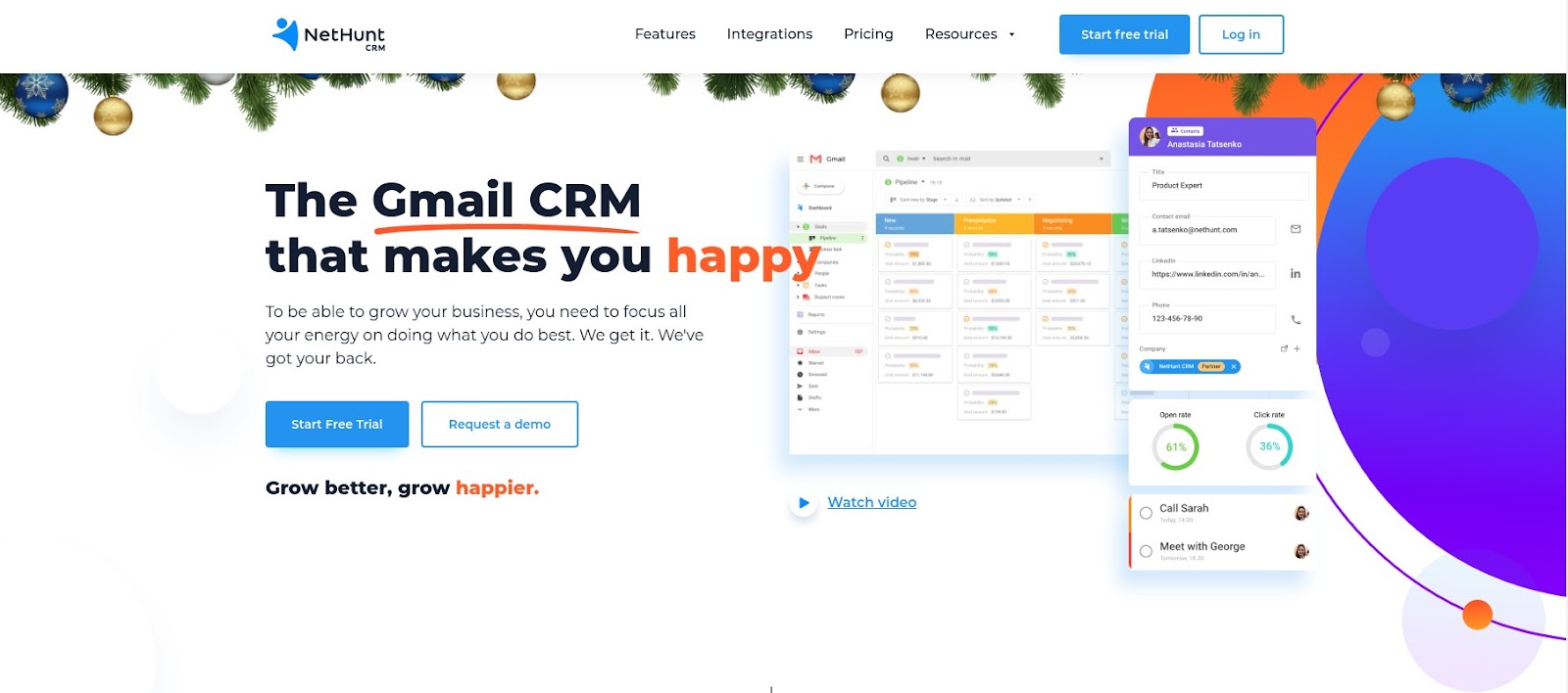
Example. See how we’ve handled different CTAs on NetHunt’s landing page. Those visitors who’re ready to become our customers can click the ‘Start Free Trial’ button, while those who aren’t there yet have a tempting alternative - they can Request a demo instead. Finally, people who don’t know anything at all about NetHunt yet can Watch video to find out more about who we are.
Based on the marketing channel used it’s possible to differentiate between email CTAs, web-based CTAs, in-app CTAs, blog CTAs, video CTAs and social CTAs. All of them have a different format and adhere to the different rules of structuring.
In fact, different CTAs generally serve different purposes. You want to convert your visitors into leads, your leads into customers and your customers into brand advocates - all at the same time. The problem is - you can’t achieve all those conversions simultaneously with just one CTA. It’s not one size fits all.
Instead, you should have a separate CTA to reach each of those goals. The main types of CTAs to put on your website include:
- Lead Generation
- Form Submission
- “Read More” Button
- Social Sharing Buttons
- Event Promotion
- Product or Service Discovery
Why do you need a good CTA?
A successful, well-designed CTA is the backbone of both your sales and marketing strategies. It’s impossible to reach your full potential and improve your business performance without obtaining one. You must direct your target audience’s next steps to get exactly what you expect from them. Otherwise, you’ll end up getting pretty random chaotic results - something very few businesses can afford in the modern-day economy.
Here are the three major reasons why having an effective CTA is important:
- It motivates your sales funnel. CTAs go hand in hand with sales funnels. They are practically intertwined together - you can’t separate one from another. The entire existence of sales funnels is defined by the actions leads take (or don’t take) to enter them. CTA is a trigger that encourages a certain action to take place and, therefore, kick start another buyer’s journey. Essentially, you create continuity of the purchasing process by strategically placing your CTAs into your marketing assets. If each and every step of the buyer’s journey is connected with the previous one, it will inevitably result in a purchase. In fact, by directing your audience towards an option for the next step to take, you gently push them towards making this decision. Hence, your conversions occur more regularly and frequently.
- Your customers expect you to have it. Having a well-developed, clear CTA exactly where it’s needed the most is a part of good user experience. In modern realities, when the non-price competition is shaping almost every market, it’s important to have every little detail in the best shape possible. If your potential customer goes through the effort of exploring your website, reads through every marketing copy, compares and contrasts the offers available on the market just to find out that there isn’t an obvious way for them to buy what they want… It’s likely they just won’t buy it. You need to make sure you don’t leave your audience guessing and wondering how to proceed, but rather guide them towards a smooth sealing of a conversion.
- It strengthens your digital ads. No matter how strong your promotional message is, it’s worth nothing if it doesn’t call to action. You can rave all you want about the benefits of your product and how it can make everyone’s life a trillion times easier - if you don’t invite people to buy it, they won’t do it. CTA is the final hook of any marketing copy that inspires them to take the next step, which is particularly important in pay-per-click (PPC) advertising.
How to craft a good CTA
An important thing to remember is that you can only leverage the benefits of having a CTA if your CTA is up to the mark. It’s essential to ensure that the version you’re using is the one that’s most welcomed by your audience and, therefore, drives the most conversion.
Otherwise, your marketing efforts are doomed. Have a look at these CTA failures:
THE WHISKY EXCHANGE
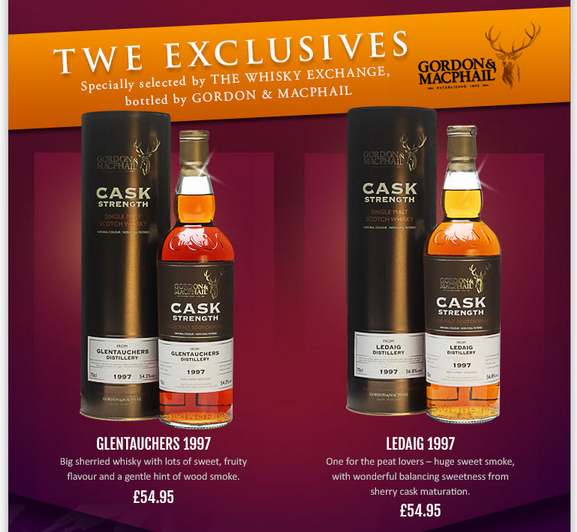
What’s wrong: No CTA
The Whisky Exchange is known for its well-converting email marketing campaigns. It’s usually very good, but this particular promotional email is an exception to the rule.
The primary goal of this email is to introduce the recipient to the exclusive offers available to TWE members and get them to purchase one of these fine products. Or so I assume. Unfortunately, there isn’t a CTA in sight to neither confirm nor deny my assumption. You just have to work your way around the offer and by trial and error understand that clicking on one of the images will take you to the next step.
No one has time to wrap their heads around a riddle like that. By failing to include a clear CTA to make it obvious what the next step should be, TWE lost a fair percentage of potential customers who would’ve otherwise bought a bottle.
MACY’S
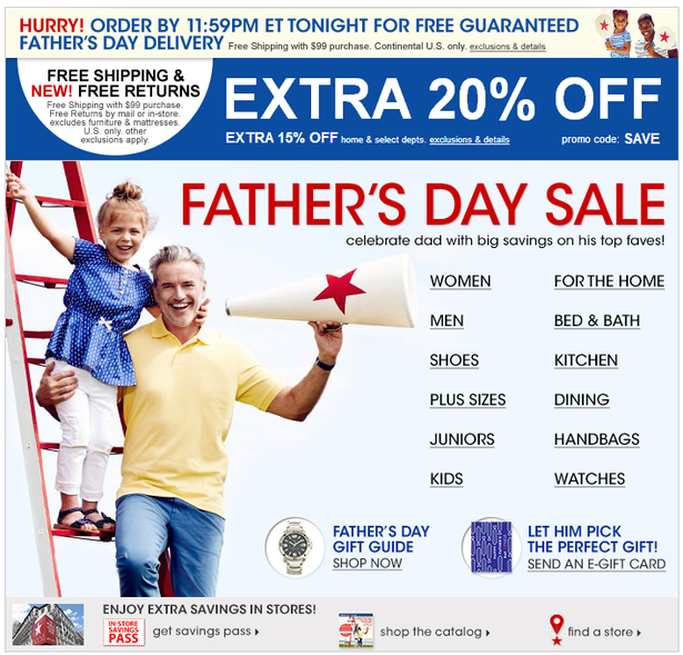
What’s wrong: Lack of consistency, too many CTAs
Macy’s has a history of including questionable CTAs in their campaigns. Unlike the previous example, there is one included… Along with ten thousand other things. There’s simply too much going on here for the readers to follow.
Instead of keeping things minimalistic and drawing all the attention to one key CTA, Macy’s decided to put several of them into this Father’s Day Sale email.
Besides, there’s no coherence between the topic of this email, the subject line (advertising presents for Father’s Day) and the offers included - the very first link is for women’s products.
VERVE COFFEE
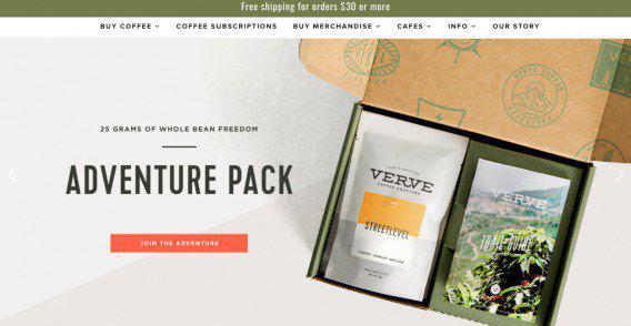
What’s wrong: CTA is inconsistent with branding
Sometimes, a faulty CTA is not about the size or the colour of the button, sometimes it’s about the call itself. It’s understandable that some brands want to stand out and come up with an original wording that will spur interest. A bright example of this is Verve Coffee and their ‘Join the adventure’ landing page CTA.
While there’s nothing wrong with the CTA itself - it’s visible, it’s actionable and it draws the attention, - it just doesn’t work that well in the context of a coffee brand. What kind of adventure am I joining by purchasing a bag of coffee? Sounds almost like a threat!
The list of CTA mishaps can go on and on, and on! It has a surprisingly large number of things that can possibly go wrong for how small of an element it is. The trick is - you can never know which one will. Even with the examples above, it’s not obvious. The judgement provided is entirely subjective - I just pointed out what I personally think doesn’t look good. Your opinion can be drastically different.
Finding the most effective CTA, however, isn’t about what you, your team, or I for that matter, think. You can be 100% certain that you’ve created the most unique, eye-stopping, best-designed button to ever exist, but none of this matters if your website visitors don’t see it that way. Above all, your CTA is a medium of conversive communication with your target audience, so you need to make sure it appeals to them before anything else.
The only way to do that is to A/B test different variations of your CTA to find that works best.
According to eConsultancy, CTA buttons are one of the most tested website elements.
That’s because even the slightest change of the CTA button can drive a massive change in conversion rate. For example, SAP used A/B testing to check the most effective CTA colour for their site, which helped them to increase their conversion rate by 32.5%. At the same time, Google tested 50 shades of blue for their CTA to determine which colour can convert more customers. [Quicksprout]
![]() Learn more about how to A/B test like a pro in our blog!
Learn more about how to A/B test like a pro in our blog!
If you need help identifying the variables to test, NetHunt has compiled a list of the most significant CTA variables and which variations tend to traditionally draw the most conversion. Let’s get started!
Wording
An image might be worth a thousand words, but you still need to pay close attention to what you say and what you don’t say. Especially if you only have a limited number of characters to get your message across.
🔥 NetHunt Pro Tip: Get straight to the point in your CTA message because the character limit is set at 35 characters per description line.
The first thing you might want to experiment with is the length of your CTA message. Usually, the best CTAs are 3-5 words long, but you can test different variations to see what works best for you.
Regardless of the length of your message, it’s important to keep your CTA concise and start it with the desired action:
- If you optimise a CTA for an e-commerce website, you might want to start your CTA with words like “shop” or “order”
- If you’re promoting a blog or a newspaper, try starting your CTA with words like “download” or “subscribe”
- If you are seeking to collect questions or prompt your audience to ask questions, go for a CTA that starts with “fill out a form for…” or “find out how…”
Another important thing to mention is that you need to watch your language. When crafting a CTA, you need to remember that different words have a different psychological effect on people. Make sure you don’t scare your audience away by using the wrong lexicon.
Joanna Wiebe of Copyhackers talks about how friction words (the words that describe what people have to do instead of what they want to do) make the reader feel like he or she has to give something up in order to attain the offer on the other side of the CTA. The most common friction words that often find their way to CTAs are:
- Buy
- Sign Up
- Submit
- Give
- Invest
- Donate
- Sponsor
- Support
- Complete
Getting rid of these can help you establish a more trusting relationship with your audience and encourage them to take action without feeling pressured to do so. I’d recommend testing softer alternatives that wouldn’t necessarily imply immediate commitment.
Example. If you absolutely must include a ‘Buy’ button, you might want to opt for a slightly softer solution such as ‘Add to cart’. While both of these options essentially mean the same thing, the latter doesn’t evoke the feeling of being bound to make a purchase right now and here.
🔥 Some other tricks you can use to up your CTA wording game:
- Use exclamation marks to make your CTAs sound more enthusiastic and, subsequently, prompt enthusiastic response from everyone who sees them.
- Opt for a CTA/USP mash-up - combine a call to action with a clear explanation of why your offer is unique. Including some reasoning behind the action that you want the audience to take will make it more likely for them to be interested in it.
- Go for numbers whenever possible. These can include the size of the discount offer, the price of the products you sell etc.
- Take advantage of FOMO - no one wants to miss out. If you create a sense of urgency and offer a one of a kind deal, your CTA will instantly become 100 times more actionable.
With all these in mind, your perfect CTA could look something like this:
Shop today for TVs under $300!
It hits every spot - it sounds enthusiastic thanks to the exclamation mark, it uses numbers, it gives a reason to click it, it doesn’t use any friction words and it hits on the FOMO element, too, with the ‘today’ bit.
In theory, this is flawless. In practice, you still need to A/B test it to see if this wording works for your audience the same way it might work for some other business.
Colour
Another important CTA variable that can drastically change your conversion rate is colour.
Performable found that the use of the colour red for the CTA button boosted their conversion rate by 21%.
[Hubspot]
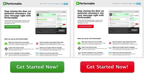
We have already discussed the ways in which colour can affect people’s perception of your brand in one of our articles about colour psychology in email marketing. The key principles remain the same for CTAs, too. You can leverage the power of colours to subconsciously affect human behaviour to drive more clicks. For instance, if you want to create a sense of urgency, you should go for the colours red or orange.
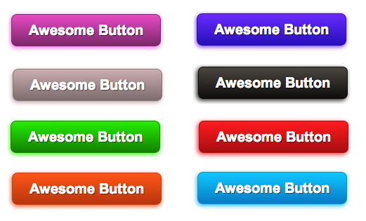
You can get creative and try to mix different colours to make your CTA pop. Just make sure to not overdo it and keep your CTA colours consistent with your regular on-brand palette.
Size
The general trend is that your main CTA should be the centre of attention while your secondary CTAs should orbit around it. This means that the primary CTA is traditionally the largest button element, with everything else enveloping it.
However, the question of ‘how large?’ remains opened. It definitely has to be noticeable. At the same time, a button too large can be deemed aggressive and assertive, therefore, not welcoming. It’s important for you to A/B test different CTA sizes to understand what impact each of them has on your audience.
🔥 NetHunt Pro Tip: Remember about the rendering on mobile devices when choosing the appropriate CTA size.
More and more people surf the internet using their mobile devices, so you need to make sure that your CTA is balanced throughout different designs and is convenient to click on regardless of the device that your visitors are using.
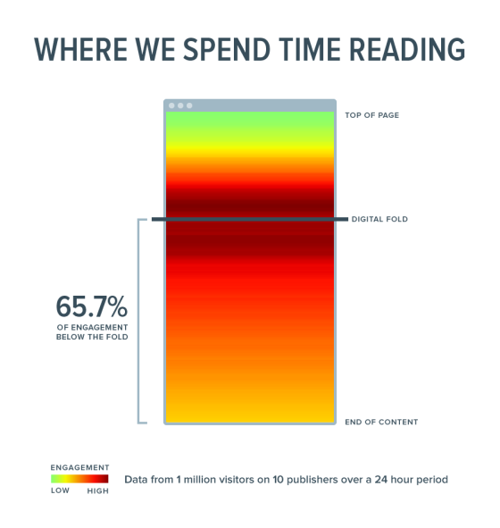
Position
One of the best ways to determine whether your CTA is located in an appropriate place is to get a heatmap of your marketing asset. By tracing the movement of your users through it, you’ll see which areas get the most attention.
You want your CTA to be the main focus visible at the first glance, so you should test out different alignment options.
A great way to make your call to action stand out is to harness the power of whitespace. People who aren’t very experienced in the design are often wary of using it, but whitespace can be your friend. By placing nothing around your key CTA, you can draw all the attention to it. Some of the ways to achieve whitespace include:
- Reducing the number of elements within your web design.
- Reducing the number of bright colours in your design.
- Keeping the space around the CTA clean and empty.
Design
At last but not least, you can add different special effects to your CTA design to test which ones drive the most conversion.
For instance, TimothySykes has received 21% more clicks on their CTA because it stays accessible even as users scroll the website.
Besides, you can also alter the appearance of your CTA buttons. They can be highlighted using unusual shapes to drive more attention.
Changing as little as one of these variables can have significant effects on your conversion rate:
- Roundness or angularity of the button corners
- Adding a 3D effect
- Adding shadow
A/B testing is a powerful technique that allows you to get the most out of your CTA and know exactly what works and what doesn’t when it comes to converting leads.
With that being said, was that CTA good or not? Let me know in the comments! (Huh, another CTA, smooth, isn’t it?)
And CTA #3... Give our CTA-related Pinterest board a look and, maybe, even a follow.
Table of Contents
Crack the sales formula with CRM Lab
Twice a month, receive actionable CRM content to your inbox.