Web form lead generation is one of the most powerful strategies nowadays. It can enrich your CRM system with a lot of new records and prompt your business’ growth. But only granted that your web forms get filled out and submitted. Unfortunately, low conversion rate is one of the biggest problems marketers face with web forms.
If that sounds like a bit of you, look no further! The gurus of web forms, we know exactly what to do to increase your online form conversion rate in eleven simple steps.
In this article, you'll know the following strategies of increasing online form conversion rates:
Let’s get growing!
On-Page Recommendations to Increase Signups
Step 1: Add social proof to the page
According to a survey by The Manifest, over 80% of respondents have abandoned online forms recently, with 29% of them citing security concerns.
People are extremely wary of where their information goes, even if it’s something as minor as their first name, let alone more private information such as their email address, company and job title.
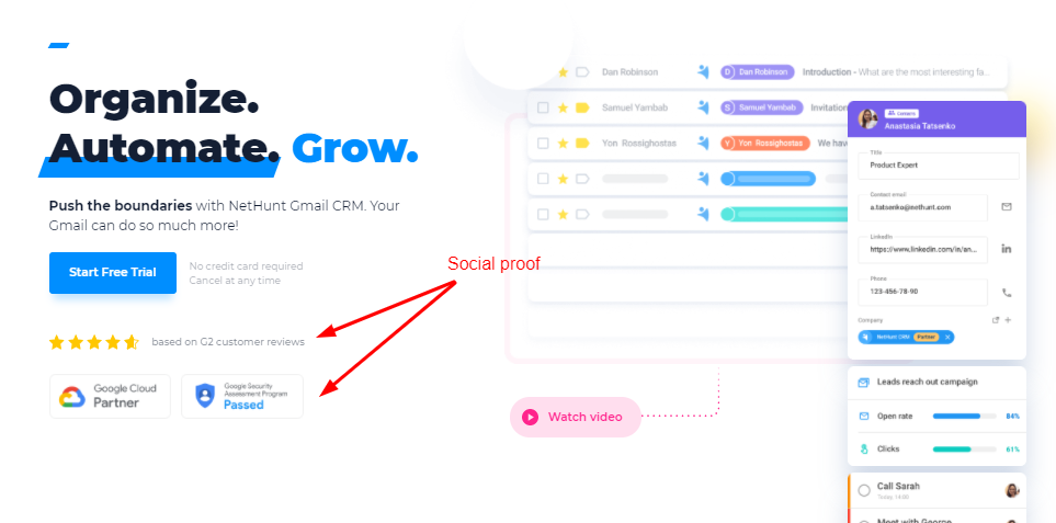
To remove the doubts and prompt more form submissions, you need to provide social proof. Make it apparent that you’re a trustworthy company that treats its leads with the utmost respect. For instance, you can include clients’ logos, partnership information, certifications and reviews from trusted websites like G2 next to your form.
Here’s how NetHunt is handling this on the homepage of our website:
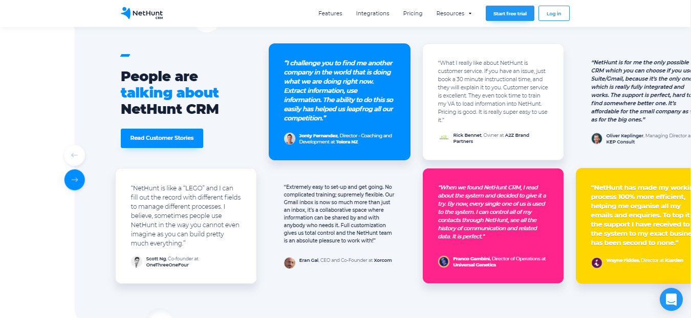
Moreover, people tend to trust people. If you want to build an even sturdier relationship with the visitors of your website straight away, consider including testimonials from your customers right next to the web form. A section with quotes from your past clients where they share their experience with your business can show the new users that you’re a business that they can trust their personal information with.
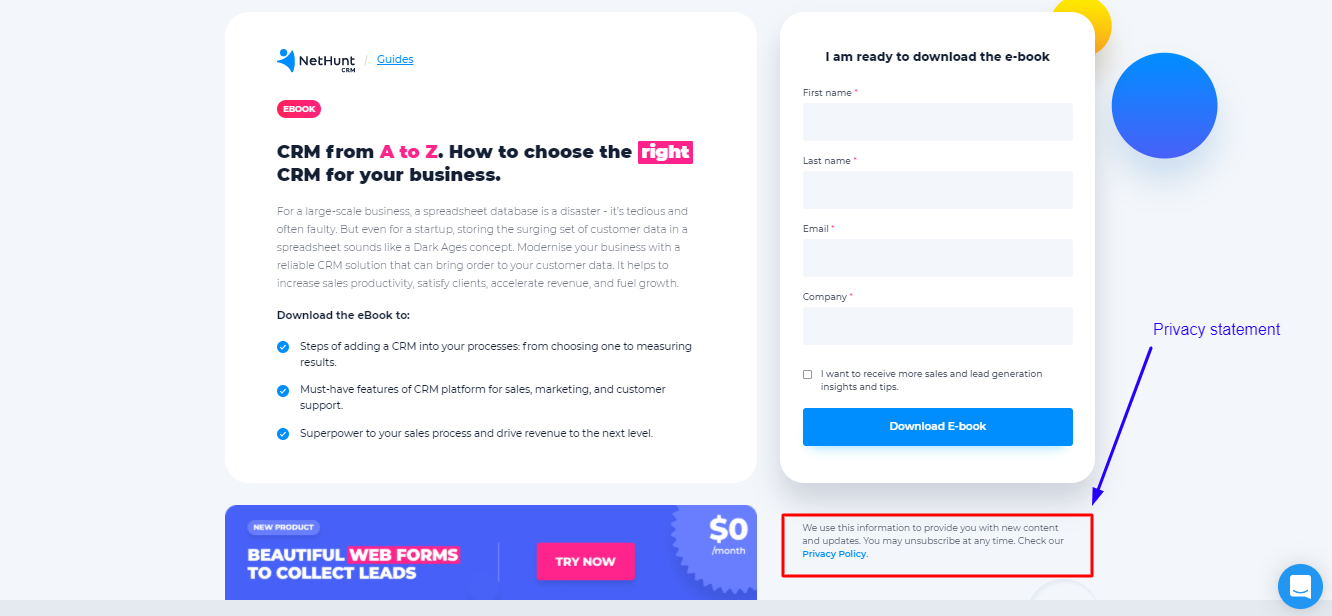
Finally, you should also include a link to your privacy policy next to the form. Not only is this required by law, but it also helps to remain transparent about your intentions.
Read more about privacy laws in different countries across the world and what they mean for marketers here.
Step 2: Make sure your pages are short and straight to the point
Let’s take a quick trip down memory lane. Do you remember the good old days when you were still an aspiring undergrad looking for a university to apply to? I do. Well, parts of it. One part of it in particular - the horrendous university websites.
If you ever tried to enroll at a university, you know how confusing their online websites can be. Dozens and dozens of lengthy pages with lots and lots of text, promotional videos and faces of happy students as social proof of the institution’s prestige. It’s almost like you need a degree to just find your way around their site, let alone find the information you need.
Very stressful, indeed!
And while universities can afford the luxury of not having clear and straight-to-the-point websites - it’s in the last year boys and girls’ best interest to crack the code to navigating those - businesses don’t have that privilege. They need to ensure the best user experience possible if they want to make sales. Especially when the competition is so high.
You need to make sure that all the important information is visible, you’re not too wordy in your copy and there are no distractions on the page. After all, when faced with too many options, people often end up choosing none. You don’t want your visitors to find an option more inciting than filling out your form or overwhelm them to the point they leave the landing page. Keep your landing page short and sweet, don’t fiddle around and tell your visitors exactly what you expect them to do.
Step 3: Communicate the value of the form
At the same time, you need to make sure that you’re providing enough reason for the visitors to become interested in filling out the form in the first place. It’s essential that you communicate the value of your form to the visitors.
Even though completing a couple of fields may only take a few minutes, you’re still asking something of people you probably don’t know very well. You need to show that you’re willing to give your audience something in return for their time and personal data. There should be a benefit for them in completing and submitting the form, and you need to communicate that value upfront. Here are a couple of ways in which you can do this without overloading your landing page to the point it’s inefficient:
- State your cause. Clearly explain why you’re collecting the information in the form.
- Keep it simple. No matter how simple your form is, provide the visitors with instructions to complete it.
- Give your respondent something useful. Bribe your visitors with an extra-valuable freebie they can get their hands on upon submitting the form.
To summarise the previous two steps, let’s make a list of characteristics intrinsic to a landing page that generates form signups and conversions:
- Clear
- Concise
- All the important information is placed on the first 1-2 screens
- Communicates the value of the form
Step 4: Place the form above the fold
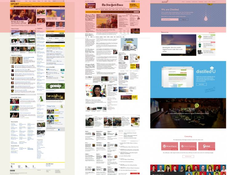
Ideally, your landing page should not require scrolling at all. But if it’s impossible to avoid, make sure that the form is placed above the fold - the area of the website that’s visible to users without scrolling down.
The exact dimensions of ‘the fold’ depends on the device your visitors are using to access the site. Based on a 1366x768 pixel screen resolution, the area highlighted in red is generally how content is presented to users on a landing page:
“The fold matters because what appears at the top of your page matters. Users do scroll, but only if what’s above the fold is promising enough. “What is visible on the page without requiring any action is what encourages us to scroll.”
[Nielsen Norman Group]
To ensure maximum engagement with your web form and, subsequently, maximum conversions, you should place it at the top of the page, above the fold. After all, that’s where most users spend 80% of their time. Visibility is a real deal maker!
Just don’t offer your visitors to fill out a form too early. Even though you want to place your web form above the fold, design the outlay of your page in such a way that you still provide some value before asking for a commitment. You don’t want your users to second-guess their decision to submit their data.
Step 5: Get your CTA straight
Ask, and ye shall receive.
The easiest way to get people to do something - sign up or fill out an online form per se - is to ask them to do it directly.
Unfortunately, not all businesses understand this. A study conducted in 2013 found that 70% of small businesses lacked a Call-To-Action of any kind let alone a clear one on their website. In 2021, things are getting better, but there are still many businesses that rob themselves of conversions simply by forgetting to include an actionable CTA button on the landing page.
No matter how eloquent you think your signup web form is, trust us, not everyone thinks the same way. A couple of words can be a total game-changer. Just remember not to make silly mistakes when designing your CTA. Here are some of the most common ones:
- a style that does not sufficiently emphasize the clickability of the button;
- a contrast that is too low to make it stand out from other page elements;
- an inappropriate location (e.g. below the float line).
When it comes to web forms, you need to also remember that if you’re using multiple CTA buttons on the page, they shouldn’t confuse visitors. Ideally, the wording of all CTAs should be the same. Then, you ensure the maximum clarity of your ask and can expect an action in return.
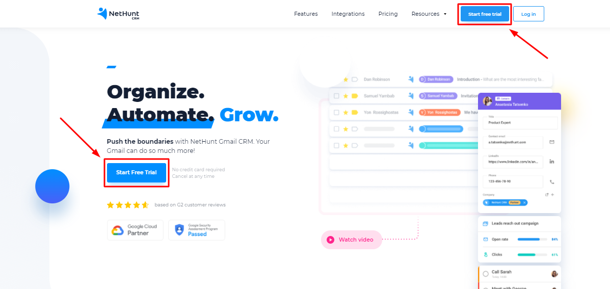
Speaking of the fold… If you do place a form on a long page, you should also ensure that no matter how deep your visitors scroll through the website, the CTA button is visible to them at all times. You can easily do so by using a plugin that ensures that your calls to action are always visible on-screen, regardless of scrolling level.
Finally, you should use the CTA button to tell people what happens next. You want to give your visitors control over their data even once they’ve submitted the form. To do that, restrain from using generic ‘Submit’ CTA buttons. Instead, give an indication of what to expect once they press it:
- Download
- Try it
- Register
- Start free trial
- Get an e-book, etc.
Sign Up Form Recommendations to Increase Signups
Step 6: Optimise for different devices
It’s 2021, baby! People are no longer tied to their desktops, they can surf the web on the go. And most likely, they do. In fact, it’s likely that you are reading this article from a mobile device, too. How do I know this?
According to Statista,
In the first quarter of 2021, mobile devices (excluding tablets) generated 54.8% of global website traffic.
You need to consider this when designing your web form. It’s essential to make sure your web form is UX-friendly for every device visitors may access your site from. Depending on the device used, screen sizes will differ and so will the way your web forms show up on the screen. You don’t want any crucial (or any at all for all it matters) elements to get lost. It’s very unlikely that users will visit your desktop version specifically to submit the form.
NetHunt’s Hot Tip
Use Google Analytics to check the most used devices on your website.
Step 7: Opt for shorter, easier to complete web forms
One of the leading reasons why people abandon web forms is because they’re too long and difficult to complete.
So, it’s a no brainer that you should keep your web forms short, both size-wise and field number-wise:
- Hubspot conducted a study in which they looked at more than 40,000 landing page results and found that as text areas (text form fields that are sized for larger amounts of text) increase, there is an associated drop in conversion rates.
- Eloqua found a correlation between the number of form fields and landing page conversion rates. In an analysis of 1,500 landing pages, they found that fewer form fields leads to higher return.
- Imagescape took one for the team and eliminated eight form fileds on their forms (and were left with just four) and saw a drastic 120% jump in their form conversion rate.
Often, you can decrease the number of fields in the form even without really removing any questions. Just approach the task strategically - there are usually ways to merge several fields into one without losing any details:
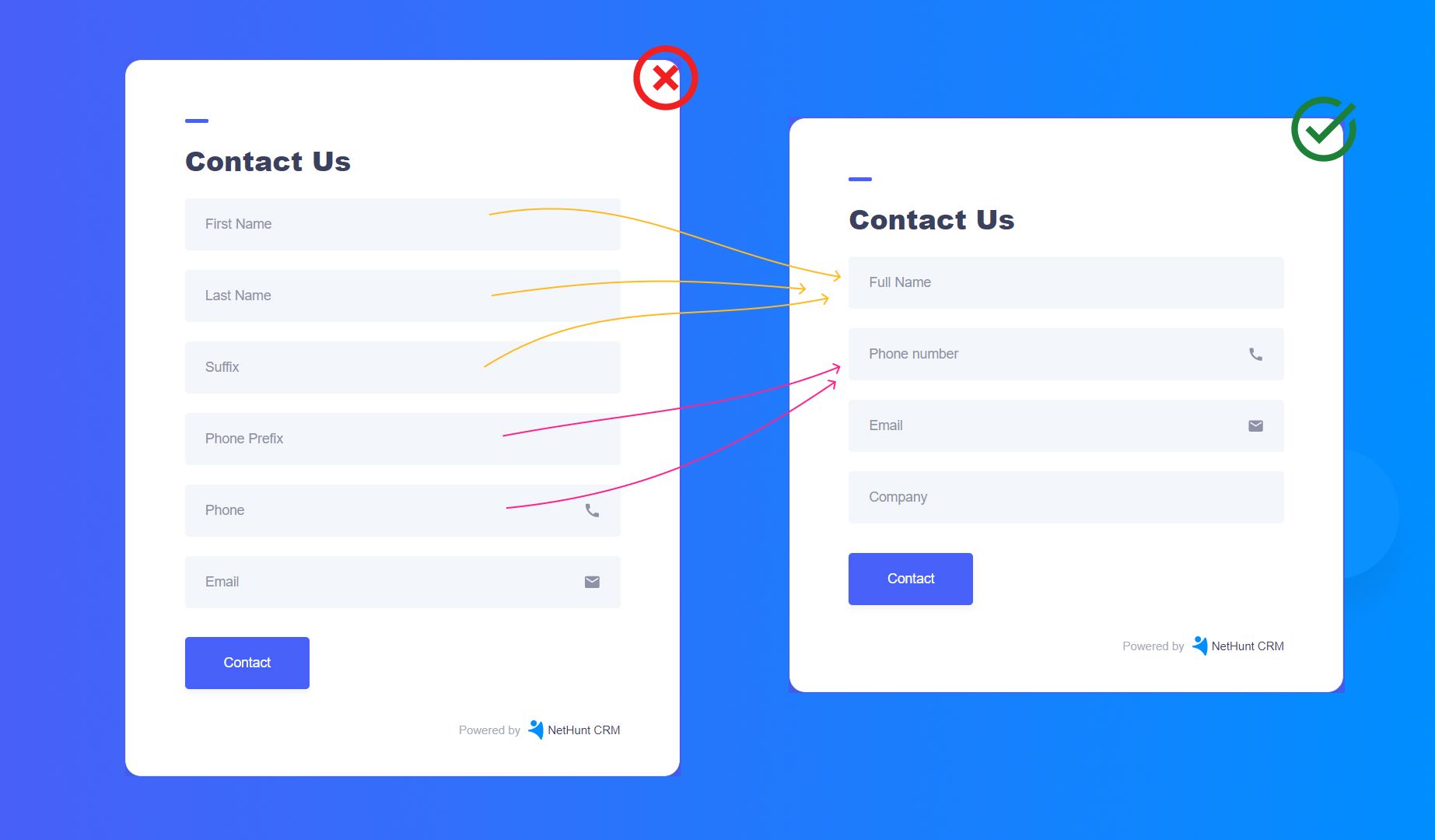
If you can’t find any loopholes, just reconsider the questions you’re asking in the first place. To keep the number of form fields low, you should:
- Only ask for essential information. Think about the data you actually need and don’t ask for more than that. Unless something is absolutely essential, consider leaving that field off the form altogether.
NetHunt’s Hot Tip
There’s a study that shows that phone number fields decrease conversion by as much as 48%, so if you can avoid asking for this information, make sure to leave the field off the form.
- Don’t confuse your respondents. Specify the exact bits of information you ask for by leaving cues and hints as to what kind of data you expect to receive. Don’t shy away from adding more context or explanatory text to help the respondent understand what to provide.
- Clearly mark required and non-required fields. Taking the time to define required and non-required fields helps users progress through forms with ease, increasing your conversion rate.
Step 8: Include autofill
Another way in which you can make it easy for your website visitors to fill out the form and therefore increase the chances of form submission is to include autofill. If you already have your respondent’s data in the CRM system, don’t ask them to waste their time on providing it again.
If the user’s answer hasn’t been recorded before, it would make sense to include a text prediction feature.
Just make sure you don’t go overboard with autofill and spoil the user experience. The feature needs to be of help to the user and not the other way round. It should not take additional efforts to decline the auto-filled information and fill in your own instead.
Step 9: Communicate errors clearly
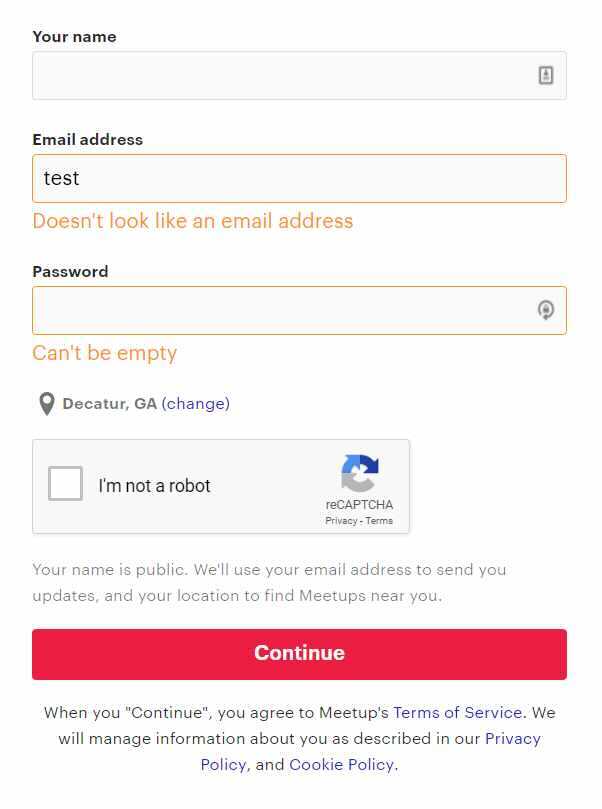
Don’t lose web form submissions because your users don’t know what kind of information you want to receive from them. Don’t leave your website visitors guessing what they did wrong when filling out the form - state exactly what the problem is and how to fix it.
Here’s how Meetup did it:
Step 10: Pay close attention to the design of your form
It’s all about the looks! Well, a lot of it is. With every little detail being important, you can’t expect people to fill out your form if it looks ugly.
There are quite a few things to consider when designing a web form:
- It needs to be visually appealing in terms of the colour scheme used.
- It needs to have legible fonts.
- It needs to have a good level of contrast.
- It needs to be on-brand.
- It needs to use appropriate images and other visual elements.
Sounds like a lot of coding to do… Or not? Luckily, there are lots of online web form builders that you can use to generate beautiful forms without having an extensive knowledge of coding.
Some online form builders even offer templates you can customise to fit you brand and purpose. For example, NetHunt Web Forms gives you twelve templates to choose from:
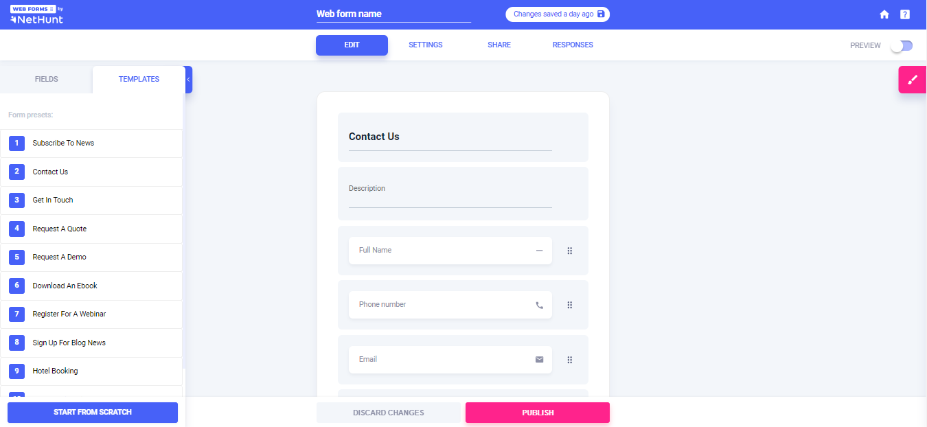
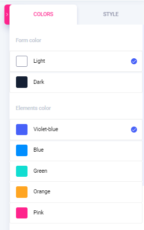
You can edit both the composition of the form and its appearance using the numerous features in the tool. For instance, you can experiment with the font colour, elements colour, background colour. Moreover, you can also choose the style of the form that fits the needs of your business best:
Step 11: A/B test headlines and CTA copies of the signup web form
Finally, you need to make sure that you adjust your web forms for the needs of your particular target audience and not just generic dudes on the internet. What works for some, may not work for others.
That’s why you need to A/B test your web form headlines, CTAs, fields and submission pages to find the combination that generates the highest conversion rate.
It’s time to put all this knowledge to good use and start increasing your web form conversions today. You have all it takes to master web form lead generation!
Let’s get converting!


 product experts — let's find the best setup for your team